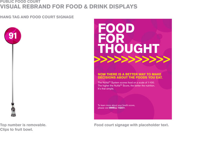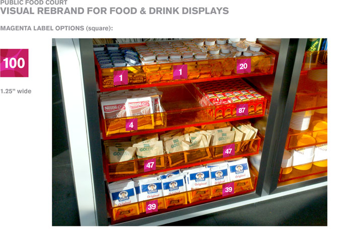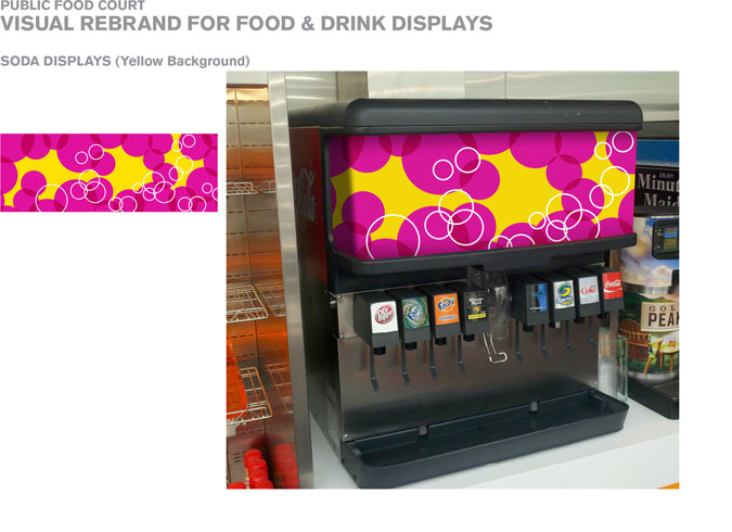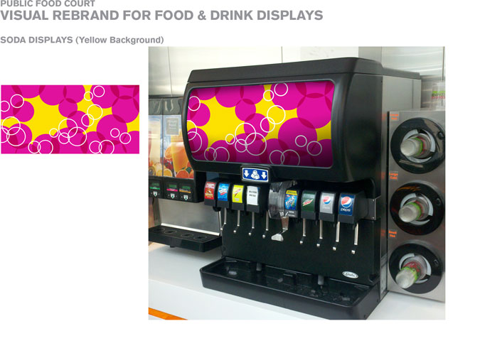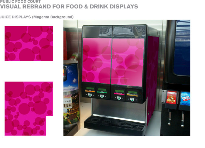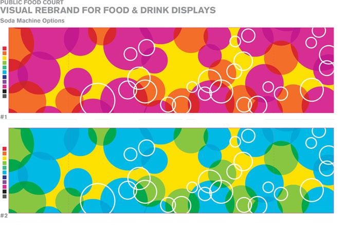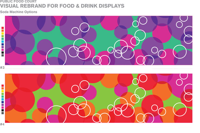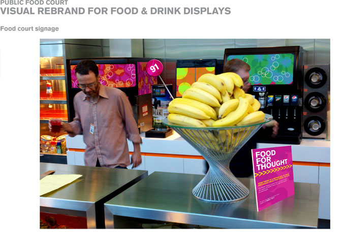
BRIEF: Develop a visual rebrand for the corporate food court.
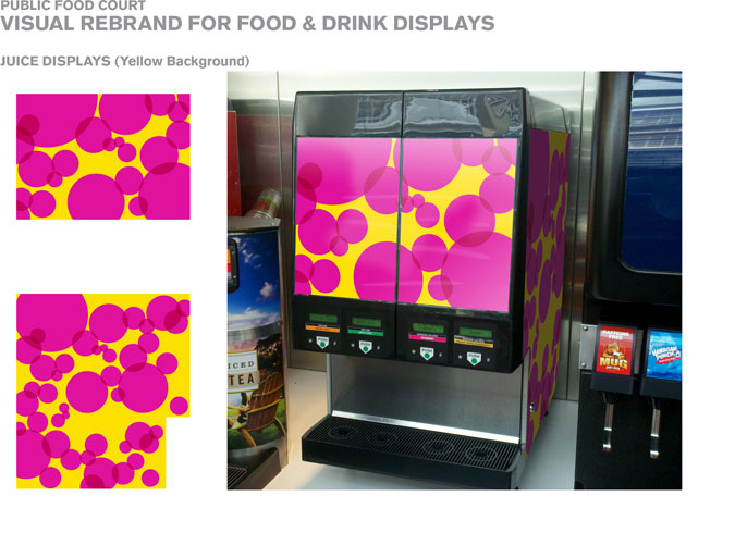
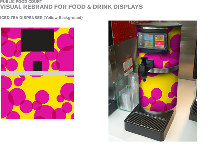
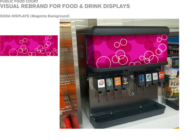
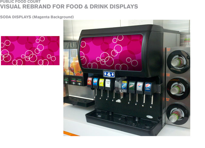
DETAILS: This project originated out of a dual need of removing the various logos on the soda machines as well as promoting awareness to the health benefits of certain snacks. Using an internal corporate color palette, the designs were to be vibrant, colorful, and fun, unifying the various soda dispensers across the food court.
The project was eventually put on hold, but hopefully someday soon it will receive the go-ahead to move into actual production.
Shown here for portfolio purposes only.
![]()
