Every now and then I get asked how I designed the ICP logo and what exactly it is supposed to represent.
I guess it all started back in the summer of 2000 or so. I had wanted to start branding all of the creative endeavors I was involved in. The website had been up for a little while, but it was still fairly clunky and needed an element to distinguish it from all the other portfolio sites out there.
One day over lunch, a friend and I were discussing the logo I was creating for her (ZakAttack Films). At some point during the conversation, she expressed that she simply didn’t grasp the concept of what I was doing with the custom figures. Did I sculpt them from scratch? How were they made? Were there lots of them?
I explained it was akin to ‘Frankenstein-ing’. As in, slicing parts from one figure and working them into another. That was the easiest way to communicate the process, but it’s also pretty accurate.
The funny thing was, this concept also applied to most of my illustration work as well, since I incorporated a lot of mixed media collaged elements into the final pieces.
This conversation sparked some ideas with me on how I could represent my work, since the logo would need to cover not only my illustration and toy work, but my animation and design work as well. However, I didn’t want to go the route of being too literal with my logo. The last thing I wanted was an image of a metal cow with little rivets on the side. Instead, I wanted something with a retro feel, and would add a bit more mystery to the design.
Anyway, that’s what got the ball rolling. Frankensteining. And it seemed only fitting to pay tribute to the scientist himself.
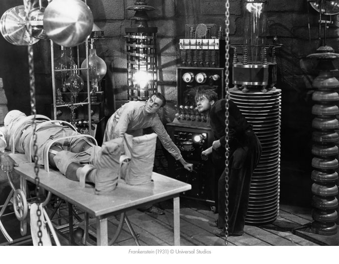
The logo would be an homage to Frankenstein’s Laboratory, since my studio certainly looked the part. There were always piles of sliced up figures and half-finished artwork littered about my work area, so it seemed only fitting. The ICP logo is based on some of the reactors seen in the background in ‘Bride of Frankenstein.’ I tossed in the lightning bolts for good measure, and to help add that retro sci-fi touch.
This is also where the “It’s Alive!” slogan comes from.
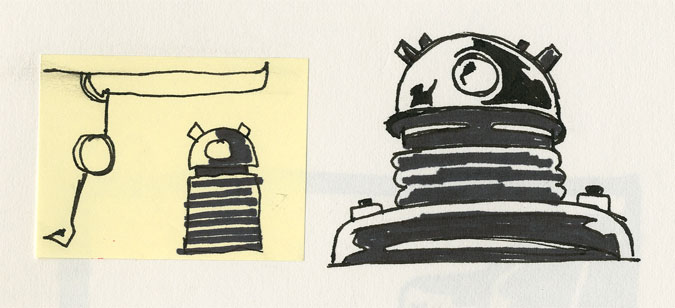
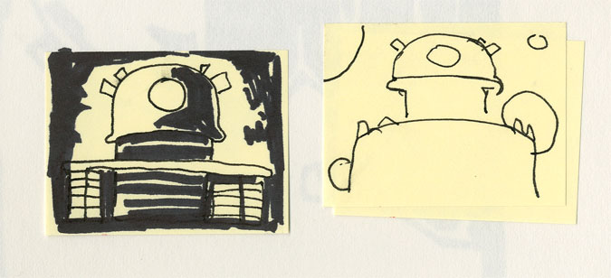
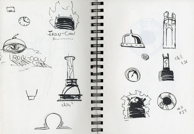
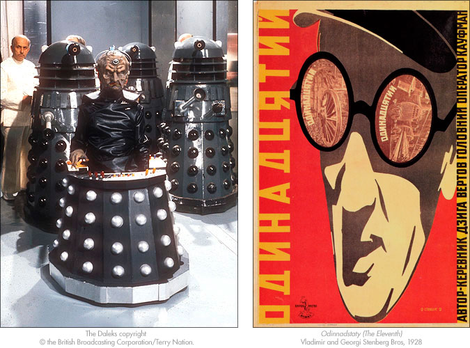
There were a few other influences that went into the design. I’m a bit obsessed with Early Twentieth Century Propaganda Poster art as well retro sci-fi. The poster Odinnadstaty (The Eleventh) (Vladimir and Georgi Stenberg Bros, 1928) pretty much dictated the color scheme for the entire site.
Plus, being a life-long Doctor Who fan, how could I not work in some elements from Davros and the Daleks? Besides, Davros was a mad scientist as well…
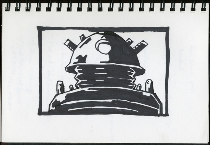
The logo started to shape up, and this was the drawing I eventually settled on:
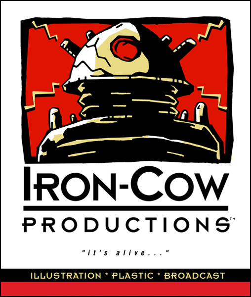
I scanned in this piece, cleaned it up digitally, and began reworking it into a logo that would last me close to ten years:
As I began entering my work into online showcases, every now and then I would generate a logo specifically for that event. Presented here are two such logos:

![]()
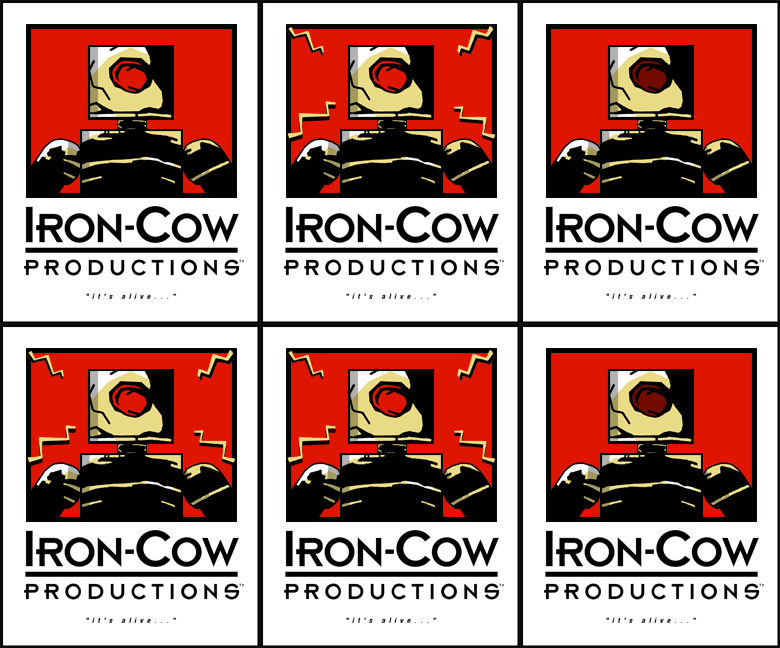
Of course, nothing is ever permanent at Iron-Cow Prod. Along came the Ten Year Anniversary, and I felt it appropriate to give the logo a little bit of a facelift.
This was meant as a transitional logo until I could finally relaunch my website. The relaunch took longer than I expected, but I now have the opportunity to unveil the logo for the new site:
So there you have it. The secret origin of the ICP logo revealed.
Enjoy!
