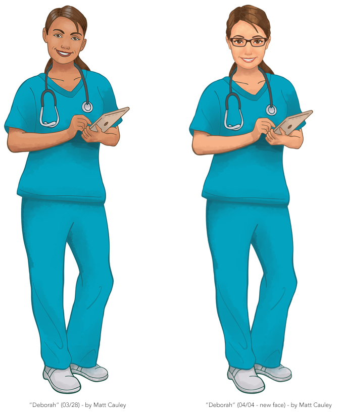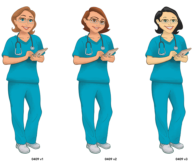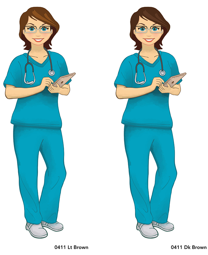
In the Spring of 2016, I was asked to design a mascot of sorts for DebMed, the world’s-leading hand hygiene company. The “Deborah†illustration would be used in a series of animated shorts, instructing nurses on the proper mechanics of hand-sanitation.
What should have been a pretty straight-forward assignment proved to be surprisingly challenging. We went through close to 20 revisions of the character, fine-tuning the design to a point where everyone was comfortable with it.
By the end of the project I had to move onto other assignments, so I wasn’t able to contribute art for scene-specific illustrations. Still, the production company was able to carry on from where I left off, and Deborah will begin educating those in the medical industry shortly.
The final version of the character is seen at the top of the page, but please enjoy a behind the scenes look at how the character evolved over time. It’s interesting to note that the client originally requested a very realistic approach, but opted to go more cartoony as time progressed.
This doesn’t include ALL the Deborah variations I created, but does help illustrate certain key points along the way.
Created Spring 2016


