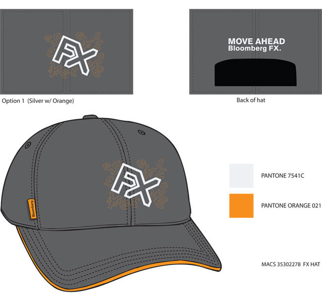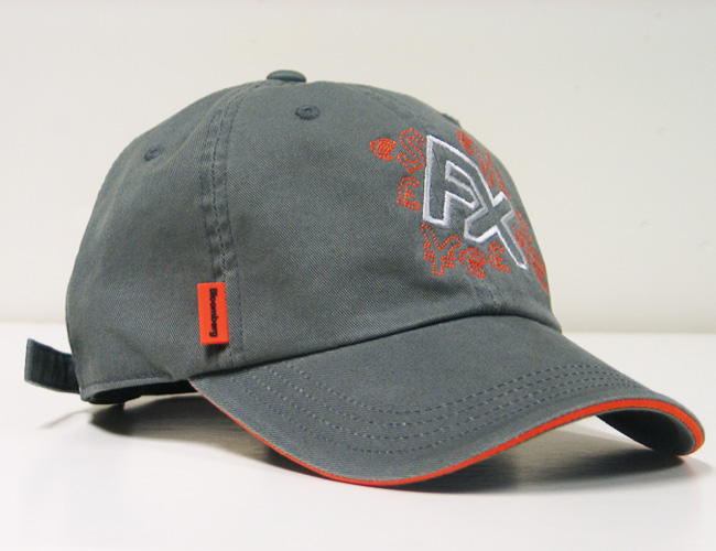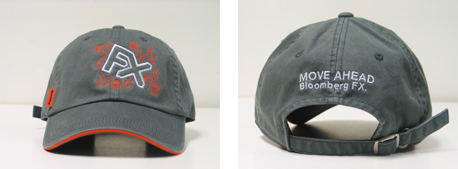
BRIEF: Develop a hat premium, based off the FX09 print campaign.
DETAILS: Using the corporate colors of orange and grey, the design was to translate a complicated set of financial and currency symbols out of embroidery. Unfortunately, the stitching wasn’t fine enough to capture the minute details, so the design had to be significantly simplified. Still, the end product was fun without being overly corporate, and was out of stock in the blink of an eye.
![]()


