Though IRON-COW PRODUCTIONS first went live on March 3, 1999, it wasn’t until July 4th of that year that it was officially announced to the public.
This portfolio website has undergone many changes since its initial launch. What began as a platform to show off the fun custom toy work begin created by my creative partner Casimir and myself quickly evolved into a larger more in-depth portfolio and visual diary of mine, showcasing my various loves of the visual arts.
Presented below is a timeline of how this portfolio site has evolved and expanded over the years.
Enjoy!

Most of Iron-Cow Prod. Version 1 is unfortunately lost to time, but I do have some images remaining of how the toy portfolio entries were treated.
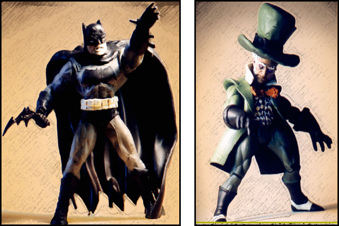
When I first launched this site, I wanted to make it clear that there would be a focus on artwork as much as the custom toy design. With that in mind, I set about altering my photography, trying to simulate a pencil-sketched background. While I was happy with the initial results, I quickly felt it was too fussy a process and perhaps not the cleanest presentation.
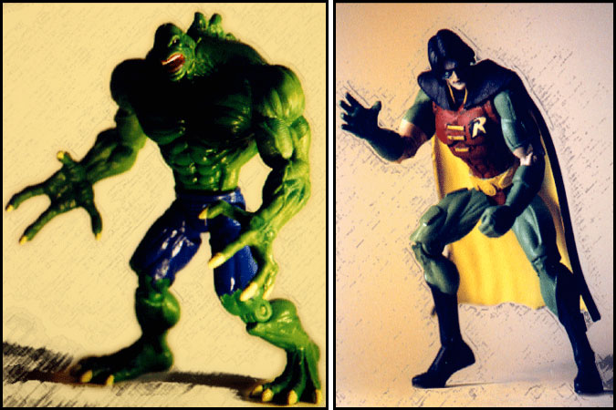
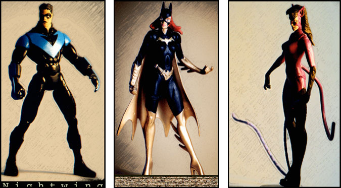
Ultimately frustrated with this look, I quickly abandoned it in favor of something a little cleaner visually…

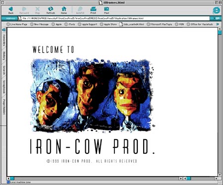
Clearly the first layout of the site simply wasn’t working, but at the very least it was a learning experience.
This second incarnation was more in line with my concepts at the time: I really wanted to present the site as a work of art itself, as opposed to a more standard basic layout. It was still pretty clunky, but at the time I was happy with the results.
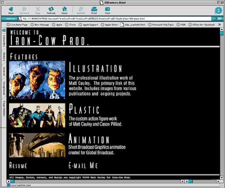
Inspired by the Art Deco feel of the Batman Animated series, I tried to carry that look and feel over into the new design.
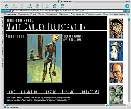
I guess it was just ignorance on my part, but as it turns out, I had all the elements for the site created far too big. While the site looked fine on my Mac (which had incredible screen resolution), viewing the site on a standard PC it was clear that all of the elements appeared just way too big.
Still, I was having fun, and it was all a learning experience anyway.
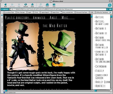
The presentation of the customs was really important to me. I really wanted to try something new instead of the ‘picture in black box’ approach. I’m still really fond of this effect, which was created using various ink splatters in Painter 5.5.

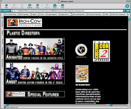
It was probably at this point in mid-2000 that ICP really began taking off.
My partner at the time (Casimir) and I were really trying to push the bounds of customizing as an art form. As I was becoming more confident with my web design skills, it quickly became clear that it was time yet again to streamline the site.
Most of the oversized elements got scaled down while other elements became further developed. Most important, though, was that ICP finally had an official logo! Better late than never, right?
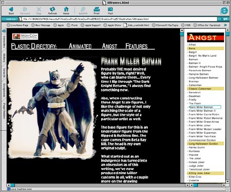
Though I was really happy with the look of the site at this point, there were a couple elements that still didn’t sit right with me. The white text on black was difficult to read and the character links on the right were actually dozens of individual image files. On a broadband machine this didn’t present a problem, but I got numerous complaints from people on dial-ups that felt the site took forever to load. Sorry about that, guys!

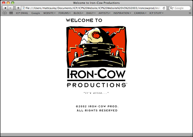
Finally, to celebrate the 3 year anniversary of Iron-Cow Prod. it was time for yet another update.
This was the version I felt really helped establish the feel I was going for. Inspired by the poster ‘The Eleventh’ by Stenberg, Vladimir and Gyorgy, the new ICP would be modeled after the Russian Poster art and design of the early 1920’s.
Click HERE to see the source of the inspiration.
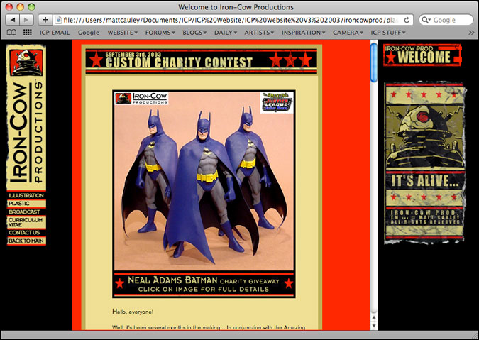
Gone were the clunky image buttons on the right (though visually I did like the appearance). The presentation of the site now mirrored a weathered poster, and thumbnail links were further added to increase the loading time.
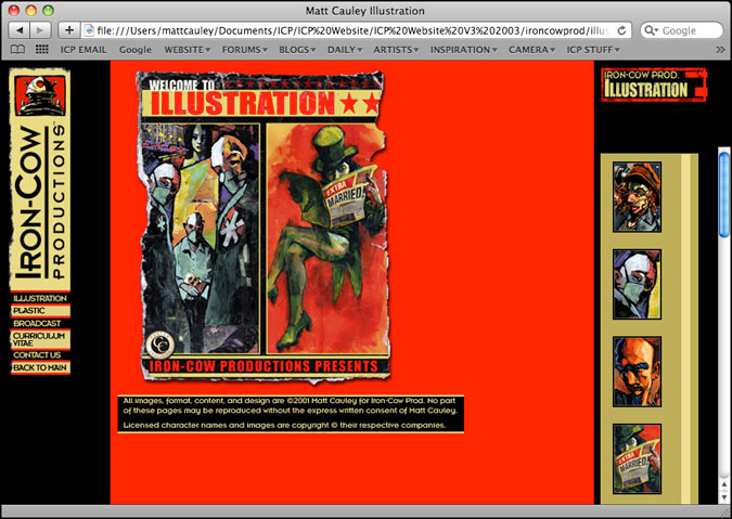
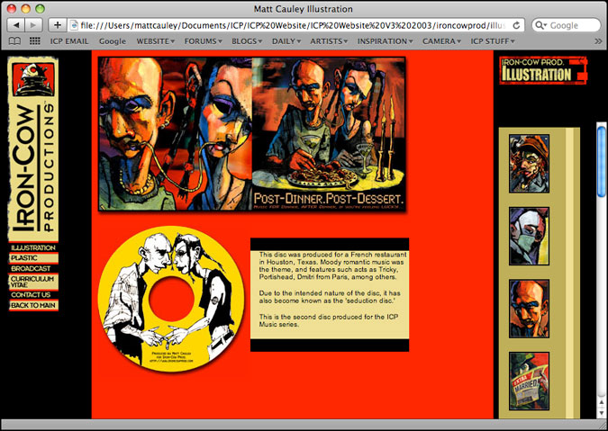
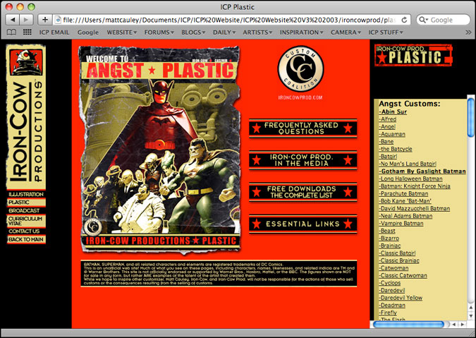
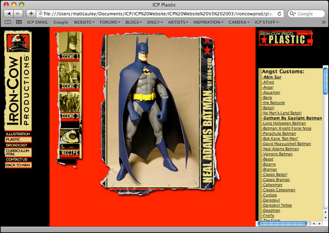
Though the site had been intended to work as one, long horizontal ticket (the type you’d get at a carnival), I never could quite get it to work. Hence the reason for the yet another revision…

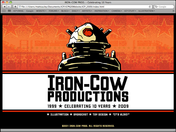
Finally! I worked out a lot of the kinks from the previous versions, and really streamlined the site as a whole.
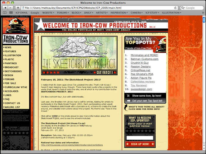
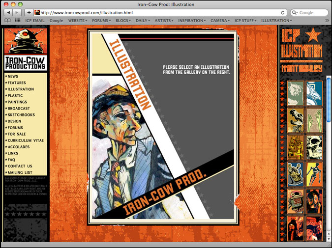
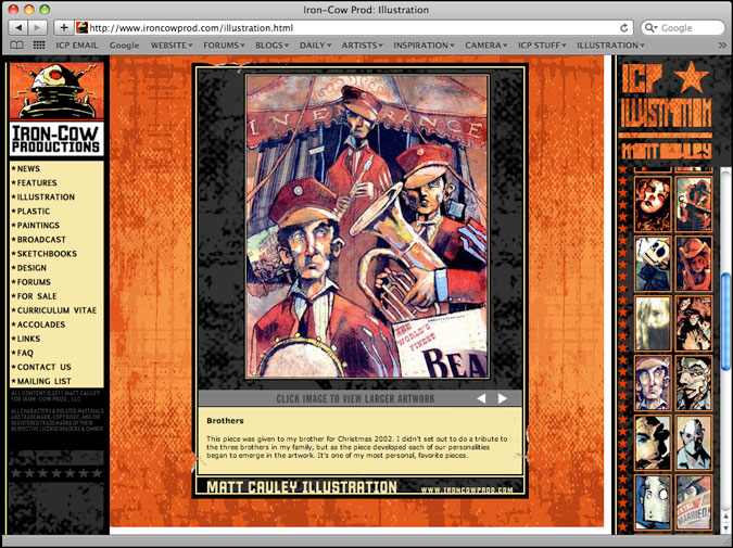
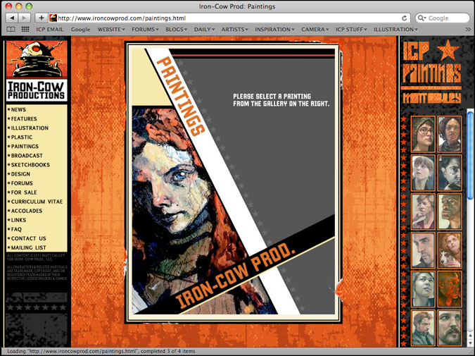
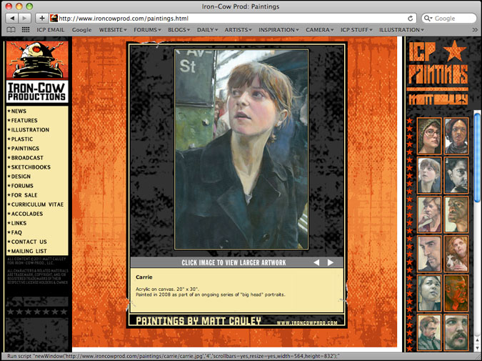
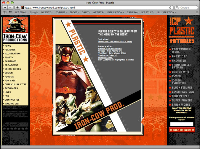
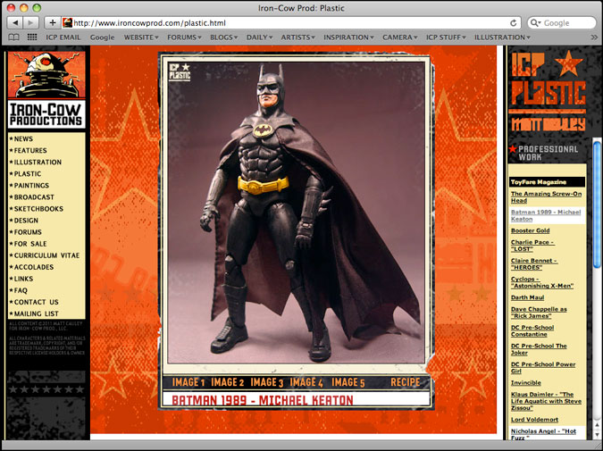
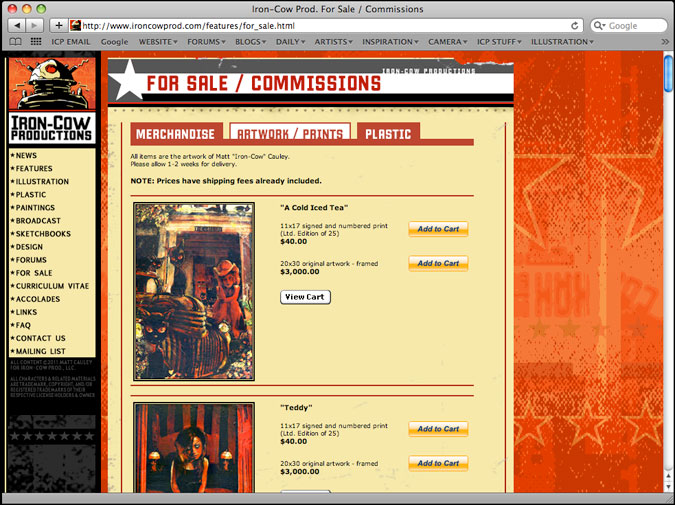

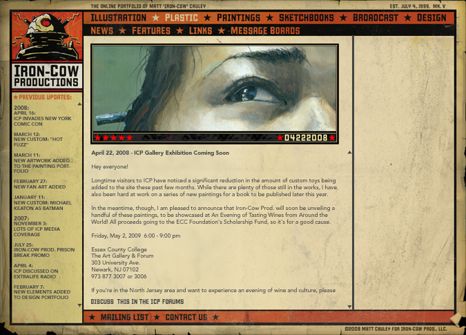
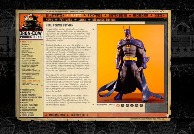
blah blah blah

Flash forward a few years, and I began to feel the limitations of the current website. It wasn’t particularly optimized for search engines, and there were little glitches here and there that had been bugging me for awhile.
Designing a new site, though, would prove to be FAR more difficult than I ever imagined. I spent two years sorting through different designs before I felt I’d latched onto something worth developing…
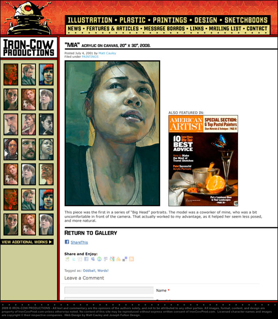
In the end, I scrapped the weathered-poster look in favor of something far cleaner. This was still a clunky design overall, but I could tell that it was a step closer to where I wanted to go…

Finally, after years of planning, the Iron-Cow Prod. Mk5 website was launched! The site was rebuilt from the ground up, and would now take advantage of the WordPress publishing engine to present the viewer with a more organized navigation, cleaner user experience, and overall more efficient method to enjoy the site.
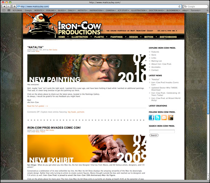
The HOME section would feature a blog-type format, highlighting the latest entries both in the main body of the page as well as featured highlights in the right-hand nav bar. New methods of communication were introduced, allowing followers of the work to receive updates via email, Facebook, and Twitter.
Though the poster propaganda design elements are still a legacy element from the previous versions of the site, it has been toned down significantly. By allowing the entries to sit on a nice, white field, it truly lets the colors of the individual entries pop dramatically.
I owe a very special thanks to my longtime friend Herb for convincing me that a clean approach really is the best approach. Thanks, Herb!
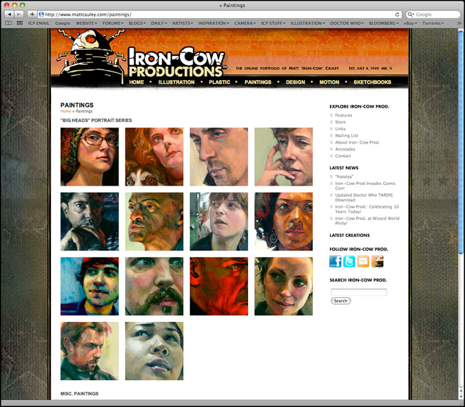
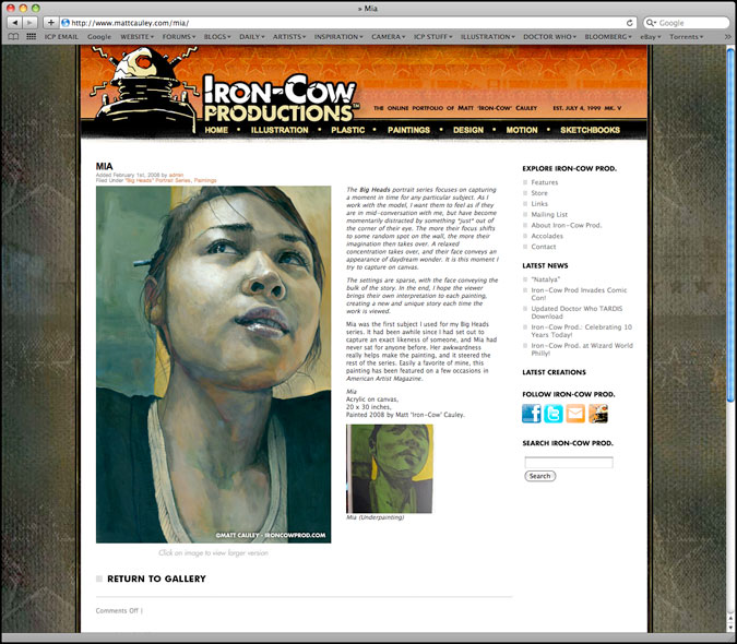
Given that people had increased access to larger monitors and faster bandwidth, I began re-introducing more graphical navigation elements that I had long wanted for the site. Thumbnails would form a mini-gallery, and individual artworks would be given a much larger stage to be displayed.
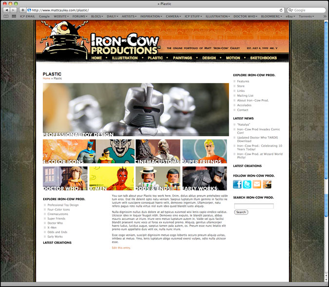
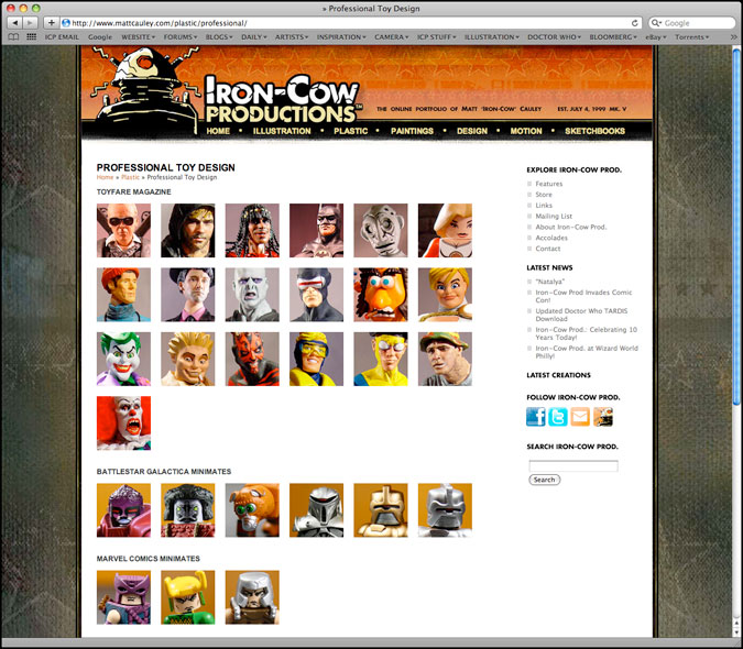
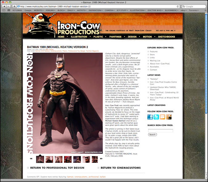
Every single image in this new Iron-Cow Prod. site is optimized for search engines, and will allow for easier ways to link to and share specific entries.
This latest version of ICP has been a labor of love for years now, but I couldn’t have done it without the help of some very special friends. My sincerest thanks goes out to Herb, Pierre, Steve Morrissey, Steve Walden, Joshua, and Gene for their constant insight and input along the way.
I would also like to thank Peter N. GO for convincing me to go with a dedicated server, and assisting me with all of my technical questions.
Finally, I must also give a HUGE round of thanks to Joe Fulton for building so much of the framework and functionality for this site. Without him, I’d still be toiling away as I learned more of the backend production necessary in making this site come alive.
Thank you, Joe! Words cannot express how grateful I am for the time you’ve invested helping me bring this site to fruition.
With that in mind, I hope you enjoy this new Iron-Cow Prod. as much as I had building it. I’m sure this won’t be the final version of the site, so let me close by saying “To be continued… but hopefully not for another 10 years, if all goes well!”
